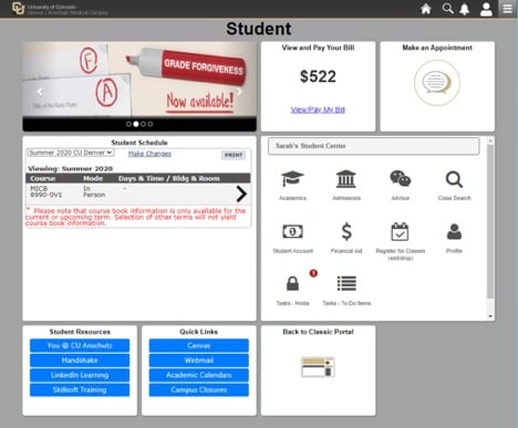
A new CU Anschutz Medical Campus student portal design soft launched on June 12. While the new portal has been in beta mode for students over the past few months, beginning this month, staff and faculty may see the elements of the new design, depending on their roles.
FACULTY
Faculty who have access to both the campus portal and CU Resources will see some changes in how they navigate to some areas.
Getting to CU Resources
Old navigation: When faculty log in, they will no longer lick the CU Resources tab to get to CU Resources.

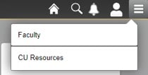
New navigation: Faculty now will open the hamburger menu on the top right corner of the campus portal and select CU Resources.
Getting to the campus portal
Old navigation: To return to the campus portal, faculty will no longer use the three dots menu.
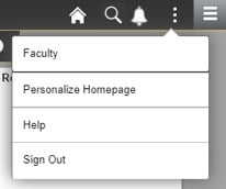
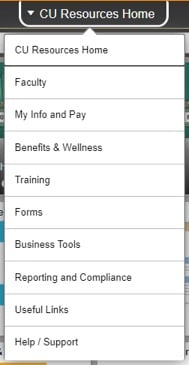
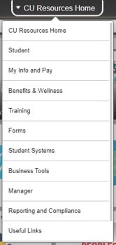
New navigation: Faculty now will use the dropdown menu under the CU Resources Home link on the top center and select Faculty.
STAFF
Staff members who only access CU Resources area of the portal should not notice any difference. There will be some changes if a staff member is or was a student at CU Denver or the CU Anschutz Medical Campus at any point.
Getting to CU Resources
Old navigation: When staff members with student access log in, they will no longer click the CU Resources tab to get to CU Resources.

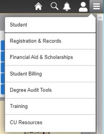
New navigation: To get to CU Resources, they will access this area from the hamburger menu in the top right corner.
Getting to the campus portal
Old navigation: To return to the campus portal, staff will no longer use the three dots menu.
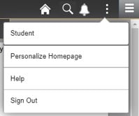
New navigation: Staff now will use the dropdown menu under the CU Resources Home link on the top center and select Student.
STUDENTS
For the past few months, students could access and try out the newly redesigned portal from a tile on their portal homepage.
Following the soft launch of the new portal, students will be able to access the classic portal design in the same way.
New CU Anschutz Medical Campus student portal
Guest contributor: CU system

.png)

