Mapping cancer’s impact across Colorado is now easier than ever for medical professionals, researchers, and others, thanks to a new interactive platform from the University of Colorado Cancer Center.
Exploring Cancer in Colorado (ECCO) is a tool providing a host of data in map form, a customizable atlas of cancer and related information across the state. And maps created using ECCO can be downloaded and used in reports and grant applications.
ECCO displays color-coded information on rates of cancer and various other health issues, demographics, disparities, risk factors, environmental exposures, and social health determinants, and allows users to quickly grasp how those factors are different from place to place – by county or even by neighborhood census tract. Users can also pinpoint locations for cancer prevention, treatment, and survivorship resources.
For example, a user could set ECCO to display varying levels of radon exposure, or places with the highest smoking rates, or where cancer mortality is rising or falling. It can even pinpoint where various groups are least likely to have health insurance, or where regular medical exams are least common.
ECCO draws entirely on public data sets, and there’s no password, so it’s available for anyone to use – a cancer researcher looking to generate new hypotheses, a community group or public-health agency seeking to pinpoint cancer burden in particular areas, or a student, journalist, or Colorado resident seeking a better understanding of cancer’s reach across the state. The data sets are regularly updated, so ECCO users get the latest information.
From static to dynamic
Creation of ECCO was led by the CU Cancer Center’s Office of Community Outreach and Engagement (COE) as part of its mission of advocacy, education, outreach, engagement, and community-engaged research in Colorado.
“One of our key aims is to monitor and share information about cancer burden in Colorado,” says Jan Lowery, MPH, PhD, COE’s assistant director for dissemination and implementation and a cancer epidemiologist and public health practitioner. “We’ve been doing that through fact sheets available on our website that are static. But when we had the opportunity to build something that’s more interactive and dynamic, that’s what we wanted to do.”
A similar platform was launched in 2022 by the University of Kentucky’s Markey Cancer Center, called Cancer InFocus Kentucky. “We used their model, and with the help of our data science partners, were able to build our own version internally, which is fantastic,” Lowery says.
ECCO was developed by Sean Davis, MD, PhD, the CU Cancer Center’s associate director for informatics and data science, and team members Vincent Rubinetti and Faisal Alquaddoomi. All three are part of the CU Department of Biomedical Informatics.
COE itself will be a key user of ECCO, Lowery says. The new tool will help the office target its activities to where they will have the greatest impact, as well as enable COE to more easily inform and educate the CU Cancer Center’s community partners and support cancer research relevant to the cancer center’s Colorado catchment area.
“Our researchers are expected to do work that directly impacts our catchment area,” Lowery says. “So by helping them visualize the catchment and understand where cancer needs and disparities are across our state, we’re hoping this will help them generate new research ideas and identify certain communities in the state where they could focus their research.”
 This map, generated by ECCO, compares the rate of past cancer diagnosis by census tract across the Denver metro area. The table at upper left shows the range of rates of cancer diagnosis assigned to each color on the map. In ECCO, a user can click on each census tract and find out the diagnosis rate in that tract. The gray area at upper right is the uninhabited Rocky Mountain Arsenal National Wildlife Refuge. Image courtesy of CU Cancer Center’s Office of Community Outreach and Engagement.
A work in progress
An investigator seeking a grant could use ECCO to map out relevant information and download it into a grant application, Lowery says. A researcher who has already completed a study focused on cancer in a specific region might use the tool as a way to share results with local communities.
The tool also could play a role in helping to shape public policy. Lowery notes that ECCO can be toggled to display cancer data by state House and Senate districts, which could help a legislator identify cancer disparities among their constituents.
COE is now seeking to build awareness of the new tool and attract users. Lowery says ECCO is a work in progress and will be improved and expanded with feedback from users. Her office plans to add new useful data sets as time goes on.
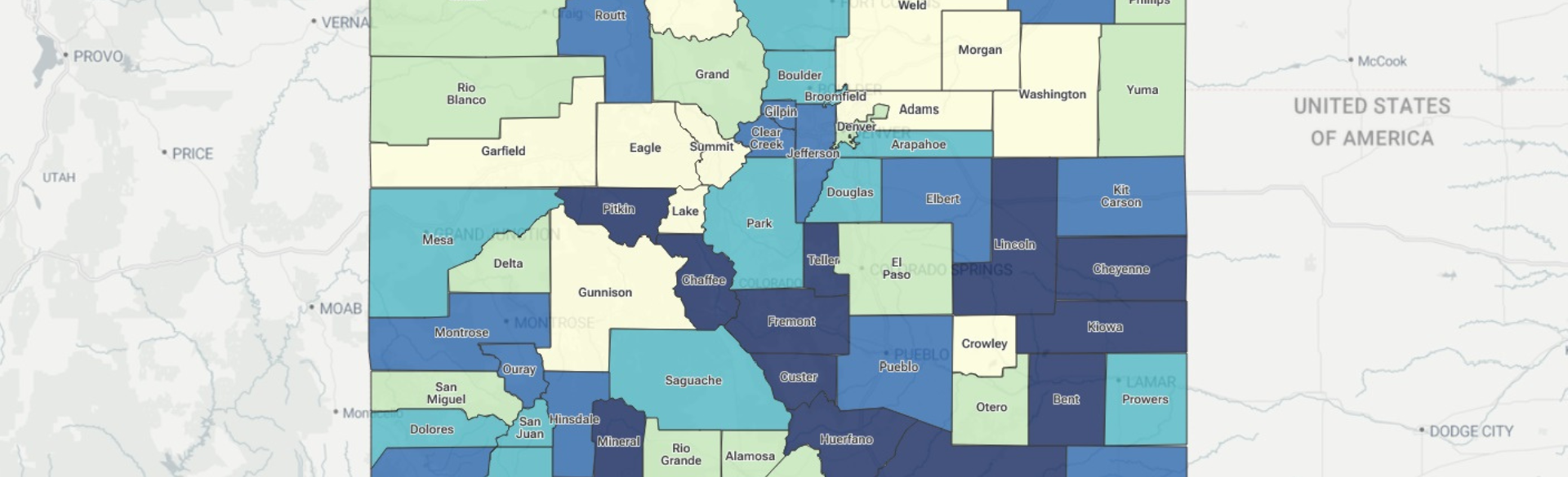
Illustration at top: A map generated by ECCO shows breast cancer disparities by county across part of Colorado. The darker colors indicate greater cancer disparities from the norm. Rankings are based on incidence, late-stage incidence, and mortality data. Image courtesy of CU Cancer Center’s Office of Community Outreach and Engagement.